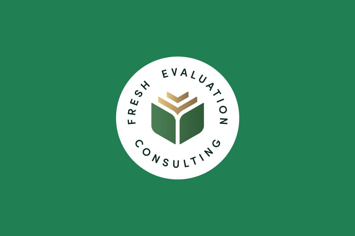
Consulting Firm Visual Identity
Fresh Evaluation Consulting
Overview
Fresh Evaluation Consulting is a nutrition consulting firm that provides program planning, evaluation, and workshops to businesses and organizations in Eastern Ontario. The logo features two leaves at its base, representing the partnership of two foodies, and concentric chevrons symbolizing client deliverables which together form a hexagon silhouette, alluding to the firm's 6 facet assessment process. The logotype uses a clean organic serif font, with soft edges and rounded corners. The result is a logo that is inviting, professional and forward-thinking, encapsulating Fresh Evaluation's science-driven approach to nutritional planning.
SERVICES
Creative Direction
Visual Identity Design
Print Design
“Without much knowledge about design, I shared my partner’s and my vision for our brand. Not only did Jordan capture this, he provided us with a final product that far exceeded our expectations. His creativity, professionalism, and passion for design were evident throughout. We are looking forward to continuing our partnership with Jordan as we grow our business.”
Danielle Mulvihill
Fresh Evaluation Consulting
Let’s talk about agency branding.
Do you need a logo design for your consulting agency? Let’s have a conversation about your vision, and craft it into something tangible. Click the button below to get in touch.


